

Landing Page Audit: 3 Mistakes That Are Hurting Darwin AI’s Conversions (And How I Would Fix Them)

Lead generation campaigns rarely fail because the product is bad. In fact, in many cases, the opposite is true: the product has real potential, but the landing page fails to communicate that value effectively.
That is exactly what I found while conducting this landing page audit for Darwin AI, a conversational automation platform designed to help businesses respond to inquiries, qualify leads, and manage customer conversations across channels such as WhatsApp, Instagram, and other digital platforms.
On paper, the offer is compelling. Many businesses lose sales opportunities because they respond too slowly, their sales teams are overloaded, or they spend hours handling repetitive conversations that could easily be automated. A solution like Darwin AI can help reduce operational workload, improve response times, and streamline customer communication.
However, after reviewing the landing page used to generate demo bookings, I identified several issues that are likely limiting its conversion potential.
And this is important to understand: a landing page doesn’t need to be beautiful to convert. It needs to be clear. It needs to build trust. And it needs to answer the right questions at the right moment.
In this landing page audit, I’ll walk through the three main issues I identified and explain how I would address them through a redesign focused on improving the user experience and increasing conversion opportunities.
What Is the Goal of This Landing Page?
The landing page has one very specific objective: to get visitors to book a 30-minute product demo.
And that’s where the first challenge appears.
When someone arrives from Google Ads, they usually don’t know the brand. They don’t know who you are, what your product does, or whether your solution is relevant to their business.
As a result, the page’s first job isn’t to sell a meeting.
Its first job is to help visitors understand what the product does, what problem it solves, and whether it’s worth paying attention to.
And that’s exactly where the first major issue in this landing page audit begins.
Problem #1: The Hero Section Doesn’t Answer the Visitor’s Most Important Question
First impressions are critical.
Users only need a few seconds to decide whether they want to continue exploring a page or leave. During that brief moment, they need a clear answer to one fundamental question:
What is this, and how can it help me?
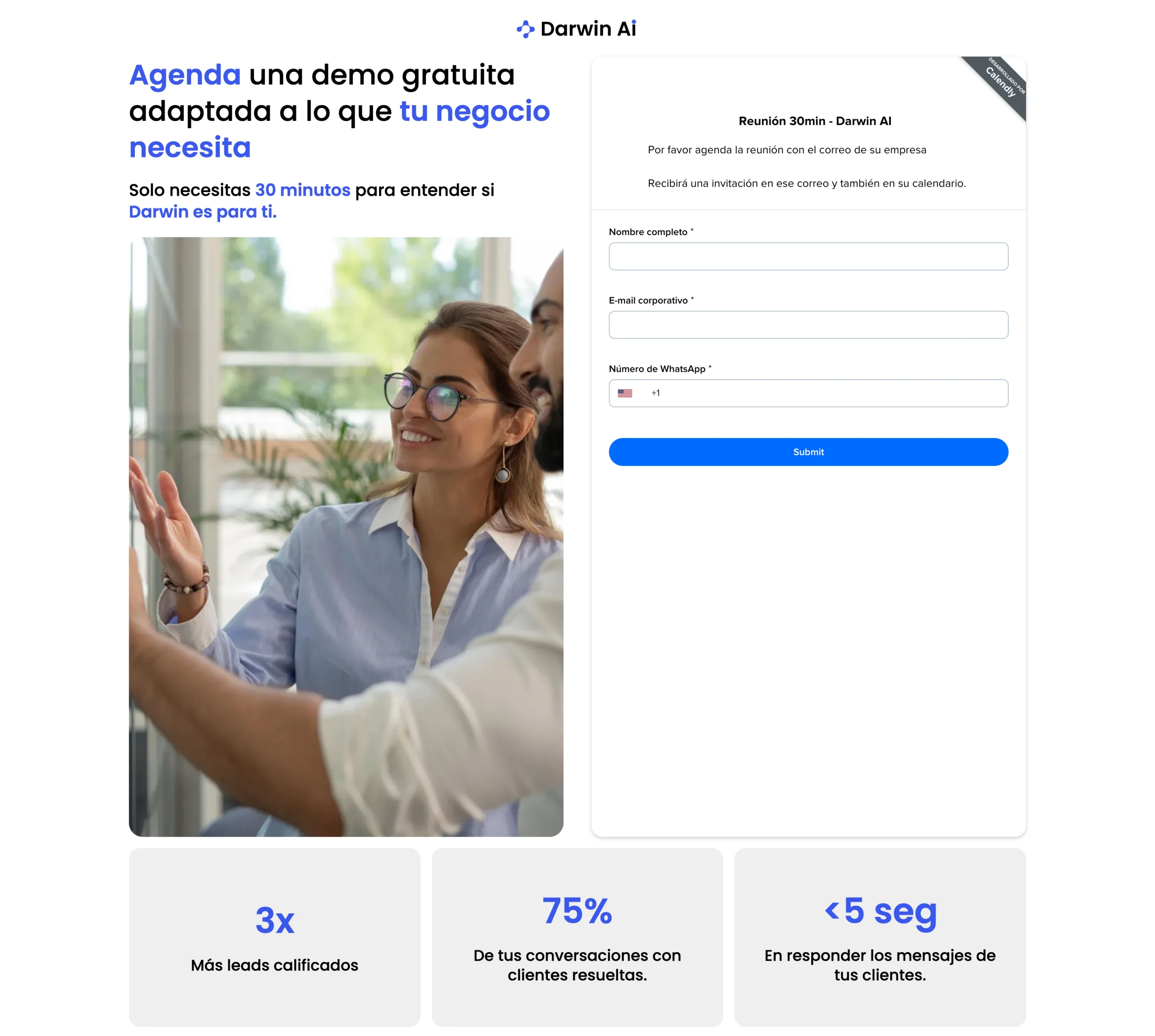
However, when entering the original Darwin AI landing page, the main headline visitors see is:
“Book a free demo tailored to your business needs.”
The problem is that this headline focuses on the action the company wants the visitor to take rather than the problem the visitor is trying to solve.
At this point, visitors still don’t understand what Darwin AI does. They don’t know what problem it solves or what specific benefits it offers. Yet the page is already asking them to commit to a 30-minute meeting.
The landing page is trying to generate commitment before generating interest.
And that’s usually a difficult combination.
The issue becomes even more obvious because the booking form takes up a significant portion of the first screen. Before understanding the product, users are already being asked for their full name, business email address, and WhatsApp number.
From a conversion perspective, this creates unnecessary friction. Visitors are still evaluating whether the platform is relevant to them, yet the page is already requesting personal information. It feels a bit like walking into a store and being asked for your contact details before anyone shows you the product.
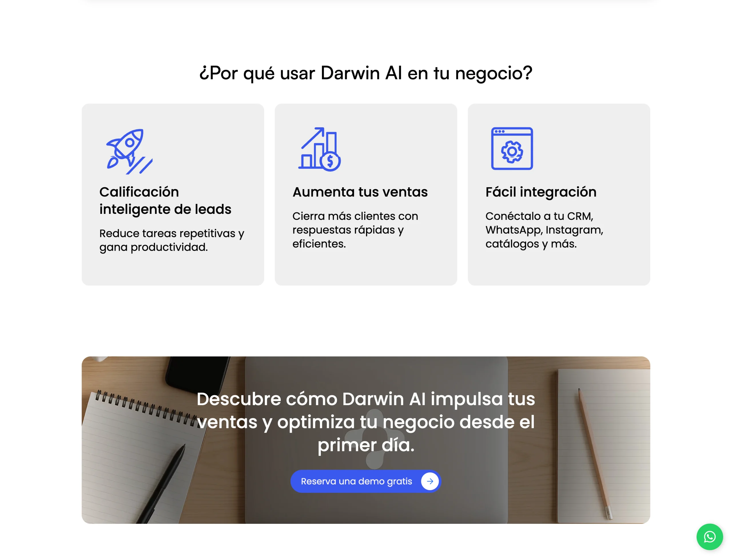
There’s also a hierarchy issue. The section that actually explains the value of Darwin AI appears much further down the page. The “Why Darwin AI?” section contains some of the strongest selling points: intelligent lead qualification, automated responses, and integrations with existing tools.
Ironically, it’s one of the most useful sections for a first-time visitor. But it appears only after many users may have already left.
The result is a landing page that asks for a significant commitment before building a compelling reason to take action.
Problem #2: The Landing Page Doesn’t Build Enough Trust
The second major issue I found during this landing page audit relates to credibility.
When a company is asking for access to your communication channels, customer conversations, and part of your sales process, trust is no longer optional. It’s essential.
And right now, the landing page raises more questions than it answers.
One of the clearest examples is the metrics section displayed near the top of the page. Figures such as “3x more qualified leads,” “75% of conversations resolved,” and “under 5 seconds response time” certainly sound impressive. The problem is that they lack context.
Visitors don’t know whether these figures come from a specific case study, an average across customers, or an internal analysis. There’s no explanation of how the data was collected or over what period it was measured. Without that context, the numbers lose much of their persuasive power. Instead of functioning as proof, they end up feeling like decorative marketing claims.
Something similar happens with the logo section.
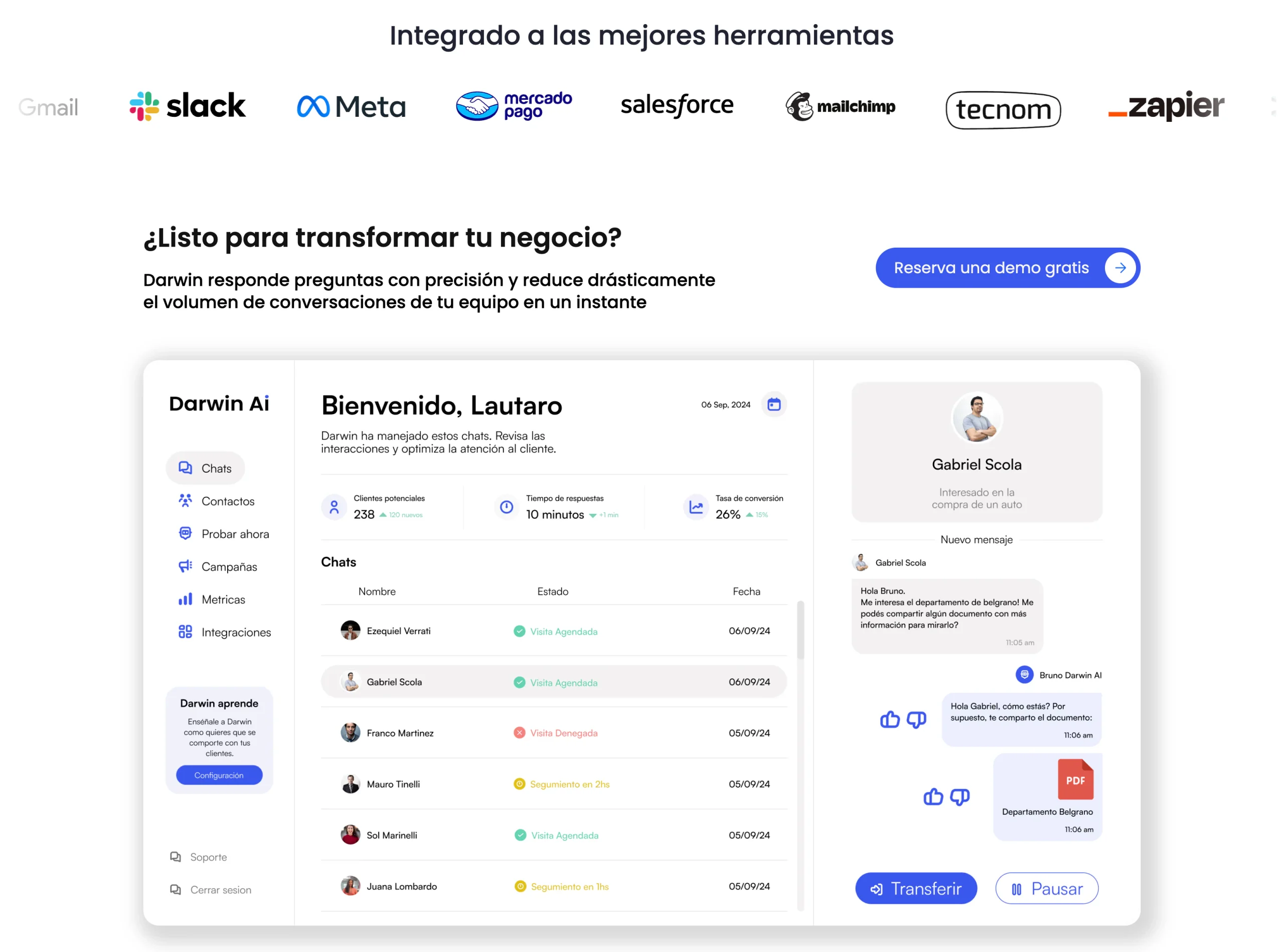
At first glance, it appears to showcase companies that use Darwin AI. In reality, those logos represent platforms that Darwin AI integrates with. While the intention is likely to highlight compatibility, the presentation can create confusion. Visitors interpret one thing while the page is communicating another.
But the biggest trust issue is the complete lack of social proof.
There are no customer testimonials. No recognizable client brands, detailed case studies, or real-world success stories that validate the offer. On top of that, visitors don’t see any photos, job titles, or other credibility signals that would help build trust.
And this matters because Darwin AI isn’t an impulse purchase. It’s a business tool that directly impacts how companies manage leads and sales opportunities. Before committing, most decision-makers want evidence that other businesses have successfully implemented it.
When that validation is missing, trust decreases and conversion rates suffer.
Problem #3: The Design Feels Too Condensed and Difficult to Process
The third issue identified in this landing page audit isn’t about the messaging itself. It’s about how that message is presented visually.
And it’s far more important than many businesses realize.
A landing page can contain excellent content, but if that information is organized poorly, users will struggle to absorb it.
As you scroll through the original page, many sections feel visually crowded. Blocks of content appear one after another with very little separation, causing multiple elements to compete for attention simultaneously.
When a page doesn’t have enough breathing room, it becomes harder for the brain to distinguish what’s important from what’s secondary.
The dashboard screenshot is a good example. Showing the product is absolutely the right decision, especially for a SaaS platform. However, the image contains so many simultaneous elements that it’s difficult to know where to focus. Metrics, conversations, menus, buttons, and interface components are all competing within the same visual space.
Instead of helping users understand the product, it creates visual noise.
This is where one of the most underrated design tools comes into play: white space.
White space isn’t just about making a page look cleaner or more modern. It serves a strategic purpose. White space helps separate concepts, establish visual hierarchy, guide attention, and make content easier to process.
That’s why the highest-converting landing pages often appear simpler than they really are. Not because they contain less information, but because they present that information more clearly.
In Darwin AI’s current version, the lack of visual breathing room makes it harder for users to follow the journey the page is trying to create.
My Redesign Proposal for This Landing Page
After identifying these issues, I completely restructured the landing page around a flow that better reflects how people actually make decisions:
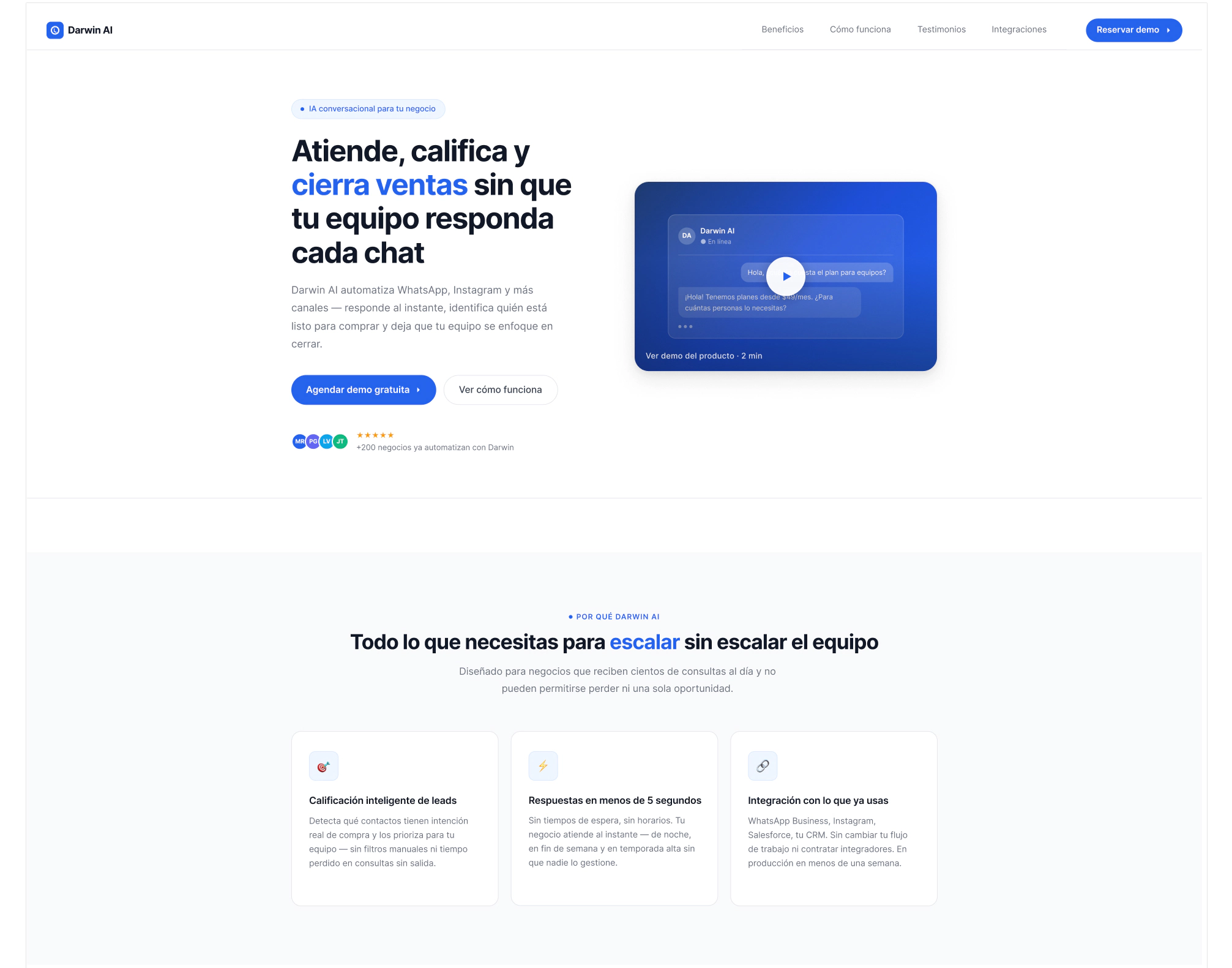
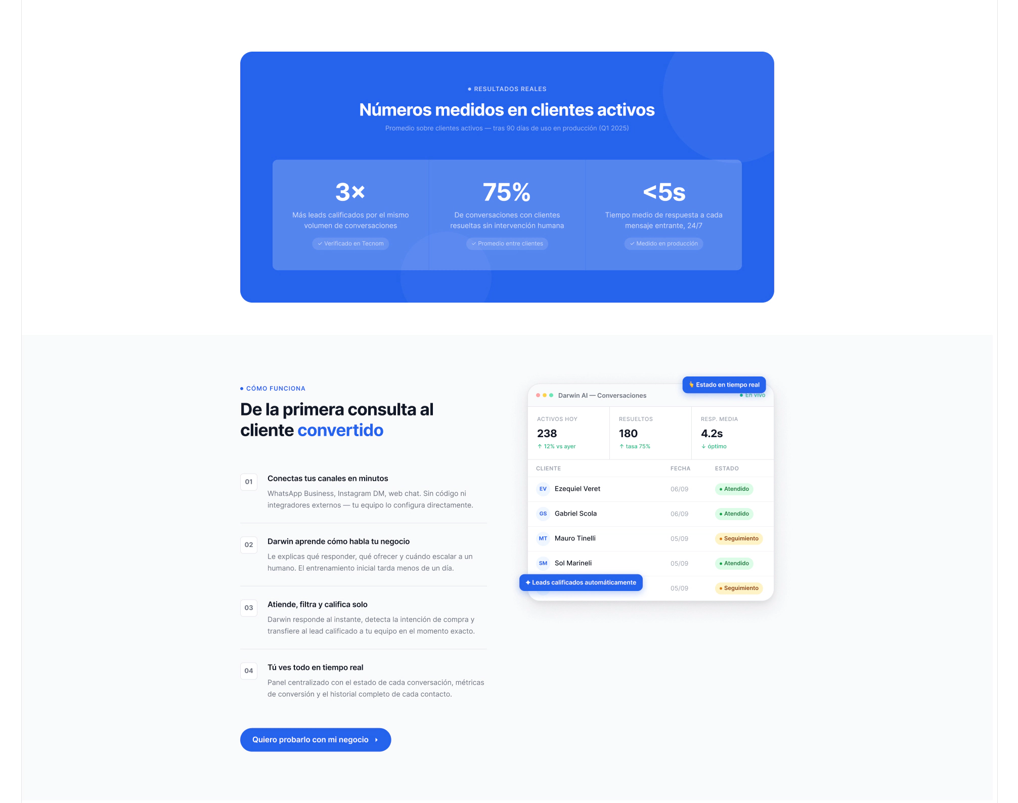
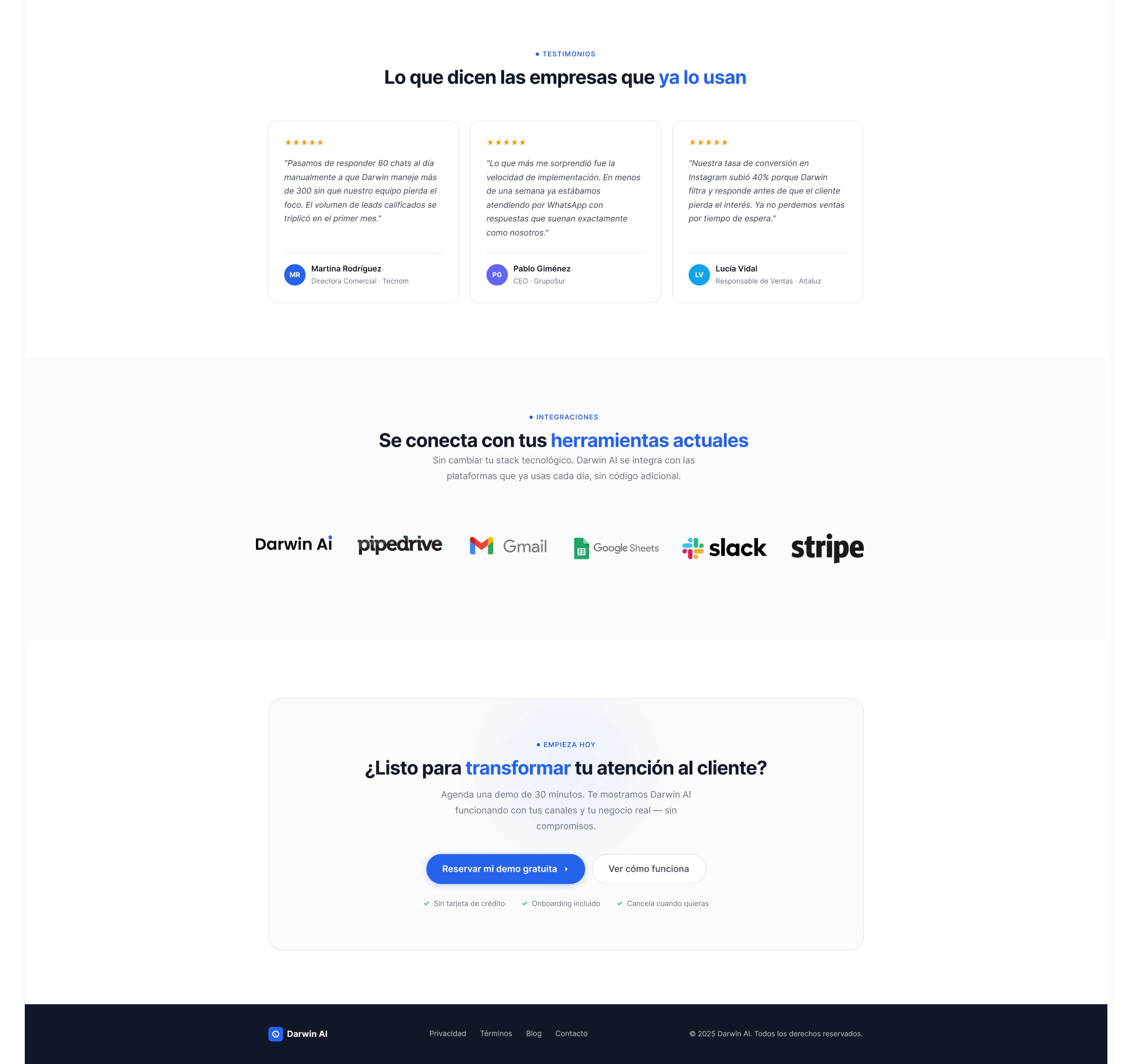
The first objective was helping visitors understand what the product actually does.
To achieve this, I redesigned the hero section from scratch.
Instead of beginning the experience with a lead capture form, the new version focuses on explaining what Darwin AI is and how it helps businesses. The goal is for users to understand the value proposition within seconds, without needing to scroll through the entire page. To reinforce that message, I replaced the generic image with a short product demonstration video.
When you’re selling software, showing the product is often more persuasive than describing it. A quick video helps visitors understand how the platform works, what the interface looks like, and what tasks it automates.
I also introduced two different calls to action. The primary CTA remains booking a demo, but I added a secondary option for visitors who aren’t ready to talk to sales yet and simply want to learn more about the platform. This small adjustment reduces initial pressure and accommodates different levels of buying intent.
Additionally, I moved the main benefits section much higher in the page hierarchy. When someone lands on the page for the first time, the most important question isn’t how to book a demo. It’s why they should care about the product in the first place. That’s why the “Why Darwin AI?” section now occupies a far more strategic position.
The second major improvement focuses on trust.
Immediately below the hero section, I added social proof elements designed to validate the platform from the start. These include references to existing customers, positive ratings, and quick credibility signals that demonstrate adoption and trustworthiness.
The performance metrics remain, but this time they’re accompanied by context. Rather than displaying percentages and multipliers alone, the redesign explains how those numbers were measured and what they actually represent. It’s a relatively small change, but it has a significant impact on perceived credibility.
Finally, I introduced customer testimonials featuring names, photos, job titles, and companies. Trust grows considerably when an opinion is attached to a real person and a real business.
The third improvement focuses on the visual experience.
I increased spacing between sections to create a clearer hierarchy and make information easier to scan. I also simplified some visually complex areas and used more focused product imagery. Instead of showing large screenshots packed with information, I selected specific interface sections that help users understand individual features without overwhelming them.
The idea behind the redesign is simple: Remove unnecessary noise so the product’s value can stand out on its own.
Because when a landing page is easier to understand, it’s usually easier to convert.
Conclusion: Great Landing Pages Don’t Sell Meetings, They Sell Clarity
The main takeaway from this landing page audit is that Darwin AI appears to be a genuinely valuable tool for many businesses, but the original landing page fails to communicate that value clearly enough.
The three key issues were straightforward: A hero section that asks for a meeting before explaining the product. A lack of trust-building elements and social proof. A visual structure that makes the content harder to consume.
What’s interesting is that none of these problems require changing the product itself.
The solution lies in changing how the product is presented.
A high-converting landing page isn’t simply about attractive design or well-placed forms. It’s about guiding visitors through their decision-making process, answering questions at the right moment, and giving them enough reasons to trust what they’re seeing.
Because when a product delivers real value, the difference between a profitable campaign and an underperforming one often comes down to how effectively that story is told.
If this landing page audit has made you realize that your own landing page isn’t communicating the full value of your business—or if you’re considering building a new one from scratch—feel free to get in touch. We’d be happy to review your project and help identify opportunities for improvement.
Keep Learning About Web Design and Conversion Optimization
If you found this landing page audit useful, you might also enjoy these related articles:
In both articles, we explore some of the most common issues we encounter when auditing websites and share practical recommendations to improve their performance.

